Contents
01 Logo
The TwinSix logo has a premium, corporate feel that suggests expertise in finance and consulting. The combination of the structured geometric icon with the refined serif typography creates a balance between modern innovation and traditional business values.
The Logo is designed to be scalable and work well across various applications, from business cards to digital platforms, maintaining its professional appearance and brand recognition.


02 Color
Redo’s color palette is designed to evoke trust, reliability, and financial clarity, ensuring that every touchpoint reflects our commitment to accuracy and efficiency.
Together, these colors create a strong, dependable, and forward-thinking brand identity, ensuring that Redo is instantly recognized as the go-to solution for financial corrections and optimization.
Primary Palette
Chesterfield Green
#07301E
Pistache
#F1F3CA
Ontario Blue
#0C1B3D
Aubergine
#290C45
Packard Red
#360707
Secondary Palette
Gen’s Pink
#F4A4C3
Hermès Orange
#F37021
Méditerranée Blue
#047BE2
Imperial Gold
#D3A439
Maple (logo only)
#9D7405
TwinSix Neutral
Obsidian Black
#0D0D0D
Mouse Grey
#939393
Minneapolis Frost
#FFFFFF
Soft Silver
#E8EBEF
Pistache Lite
#FCFCF7
Ontario Lite
#F6F9FD
Purple Lite
#FAF6FD
Red Lite
#FEF6F6
Gradient Palette
Chesterfield Green
Pistache
Ontario Blue
Aubergine
Packard Red
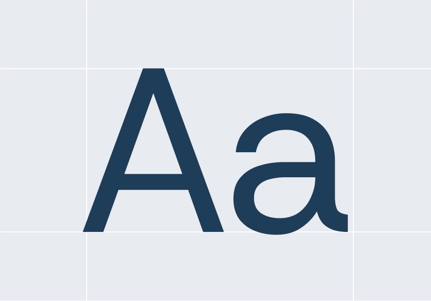
03 Typography
Primary Typeface - Inter: (Inter Sans Serif)
serves as TwinSix's primary typeface for all digital applications including websites, presentations, email communications, and social media content.
This modern sans-serif font is optimized for screen readability and provides a clean, professional yet approachable aesthetic that works excellently across user interfaces and digital experiences. Available in multiple weights from Light (300) to Bold (700), Inter should be used with line heights of 1.4-1.6 for body text and 1.2-1.3 for headings, with a minimum size of 14px for online body text to ensure optimal readability.
Secondary Typeface - STIX General: (STIX General Serif)
Functions as the secondary typeface for print materials, formal documents, and premium brand applications where traditional professionalism and authority are paramount. This serif typeface, with its academic heritage, conveys expertise and trustworthiness, making it ideal for printed reports, whitepapers, formal proposals, and executive communications.
Available in Regular and Bold weights with italic variants, STIX General should be used with slightly increased line heights of 1.5-1.7 for body text and 1.2-1.4 for headings, with a minimum print size of 10pt. The key principle is consistency within each medium—defaulting to Inter for digital touchpoints and STIX General for formal print materials, while avoiding mixing fonts within the same document to maintain professional coherence.
Primary Typeface
STIX General Serif
Primary Typeface
Inter Sans Serif
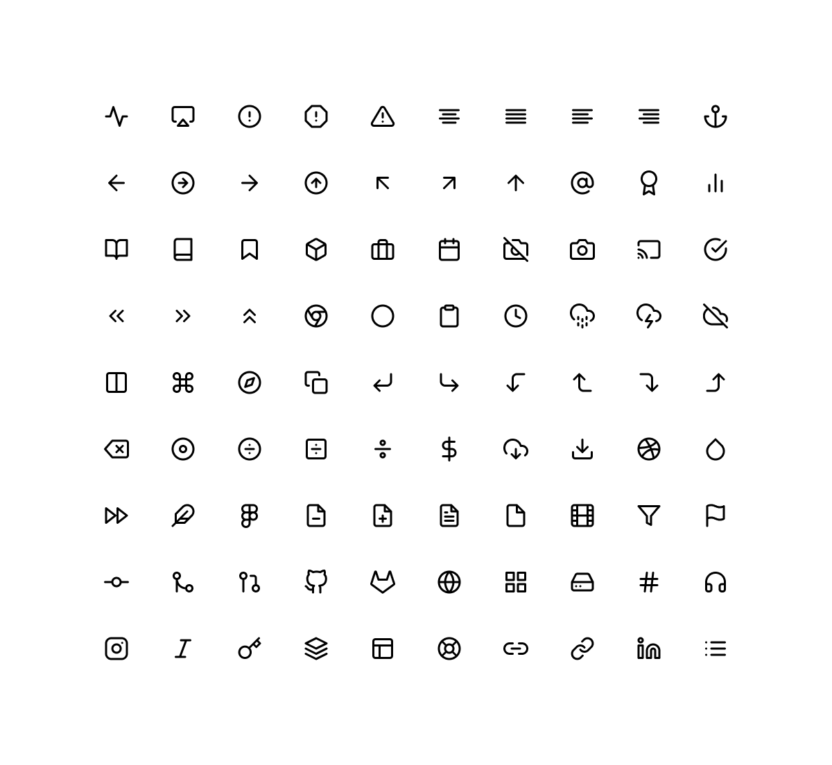
04 Iconography
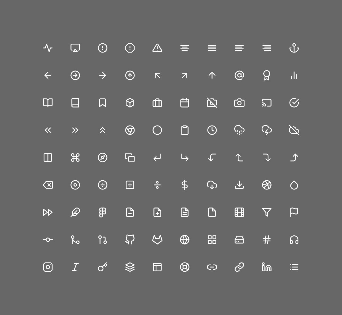
TwinSix utilizes the Feather icon set, a collection of simply beautiful open-source icons designed with a focus on simplicity, consistency, and flexibility. The icons feature clean lines, rounded corners, and a consistent stroke weight that aligns perfectly with TwinSix's modern, professional aesthetic and complements the Inter typeface used throughout digital applications.
Dark lcons
Light Icons